By Anubhuti Shrivastava, Contributor
Gone are the days when guests used to explore the nearby eatery through browsing the Yellow Pages. These days, guests merely need to type in a simple Google query or look for nearby restaurants on their map apps to find a place to eat. That means they’re finding your restaurant’s website. It needs to make a great first impression.
Fortunately, setting up a website is pretty easy nowadays and many of the big players have pre-designed web templates that you can use to get up and running. Of course, it means there are a lot of other restaurants using those templates, too. You want to stand out. And unless you have the creative in-house skills to design a unique site, you may have to turn to hiring an experienced web development company.
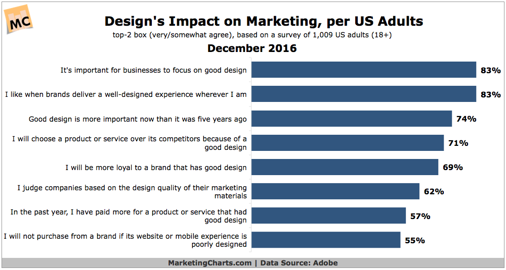
Designing an informative and attractive restaurant web portal isn't child's play. You can't manage to establish an impressive digital identity unless the design is extremely intuitive and unique. Per a 2016 survey, 7 in 10 adults in the US would pick a product or service over its business rivals due to excellent web design.
In spite of having an experienced professional, it's equally important for you to gain an idea of basic design fundamentals so that it will help you in building a web portal that can maximize your restaurant sales.
You should have a solid idea of what you’d like your website to look like. And that should be based heavily on not only your restaurant’s brand, but also modern web elements that work in driving business.
Let's look at nine such elements which you should integrate with your web design to develop a digital presence that you can be proud of.
1. Start by Stepping into Your Guests’ Shoes
First of all, you need to identify who is your target audience, their specific interests, requirements, and behavior. This will allow you to commence the website development with much ease.
For example, if your restaurant is particularly targeting families and couples then make sure that the layout is soothing and familiar to give a sense of connectivity and togetherness. If, instead, you are focusing on younger consumers, then you can experiment and use bright design and out of the box elements to make it unique and eye-catching.
2. Keep an Eye on Key Competitors & Highlight Your Strengths
In order to come up with a great website design idea, you need to take inspiration from your business rivals who are successfully operating in the same domain. Don't just blindly follow them; instead, analyze their website’s strength and use those elements but in a way that’s still unique and fits your business’s overall personality.
One of the best ways to make your website stand out can be highlighting your biggest strength or what makes your business unique. Talk to your frequent customers and understand their view of your restaurant. It could give you a whole lot of new ideas to build your website around and boost sales for your restaurant.
3. Cherry-Pick A Relevant Theme but Keep It Simple & Elegant
You have to choose a theme for your website which you can get from exploring a wide range of ready-made themes offered by platforms like WordPress. Or, you can develop a customized theme specifically tailored for your business with the help of your design team.
But whatever you choose, make sure that it's simple enough that people can browse through and easily navigate from one page to another. This will make a positive impression on your potential customers and will encourage them to pay a visit to your eatery. Moreover, choose colors that you want to use in your website cautiously and that are easy on the eyes. A wrong selection can hurt your online image.
4. Organize All the Information in A Visually Digestible Manner With Appetizing Images
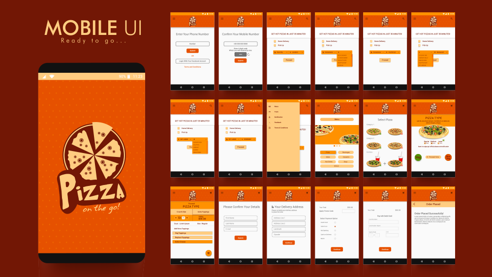
Your restaurant website will be your mouthpiece so make sure that all the essential information is displayed properly so that guests can easily notice the calls to action buttons (CTAs) and take desired actions.
Design the following sections carefully in order to enhance the overall look and feel:
The landing page of your restaurant website is your "Hero" which you need to design perfectly. Ideally, it should have compelling content, optimized images, and informational videos if required.
Moreover, your landing page can help in bringing in quality leads. With a top CRM tool, you can nurture visitors to increase the chance of conversions.Make the "About Us" section as special as possible with narrating your business journey so that people can connect. You should also talk about your values and staff expertise to grab visitors' attention.
Have a beautifully designed menu with clear categories that explain all the dishes you offer. Highlight the chef's special items, drinks, beverages, main course, snacks, etc.
Make sure to add high-end real images of dishes prepared by your chefs. It will attract more customers and encourage them to try your place. But don't include images unnecessarily as it can distract customers and drive them away.In case you have more than one establishment, guide your visitors with the help of a digital “store locator” which will make it easier for them to visit your eatery and place orders online.
Never ignore having a few integral buttons in your restaurant website such as a button for online order, feedback, social sharing, etc.
Moreover, highlighting your social media presence by integrating links in your restaurant website is one of the best ways to engage with more customers and enhance your reach. Motivate them to connect with you on social platforms and give them reasons to share your content on their personal profiles.
5. Pay Attention to ‘Above The Fold’ Area & Mobile-Friendly Layout
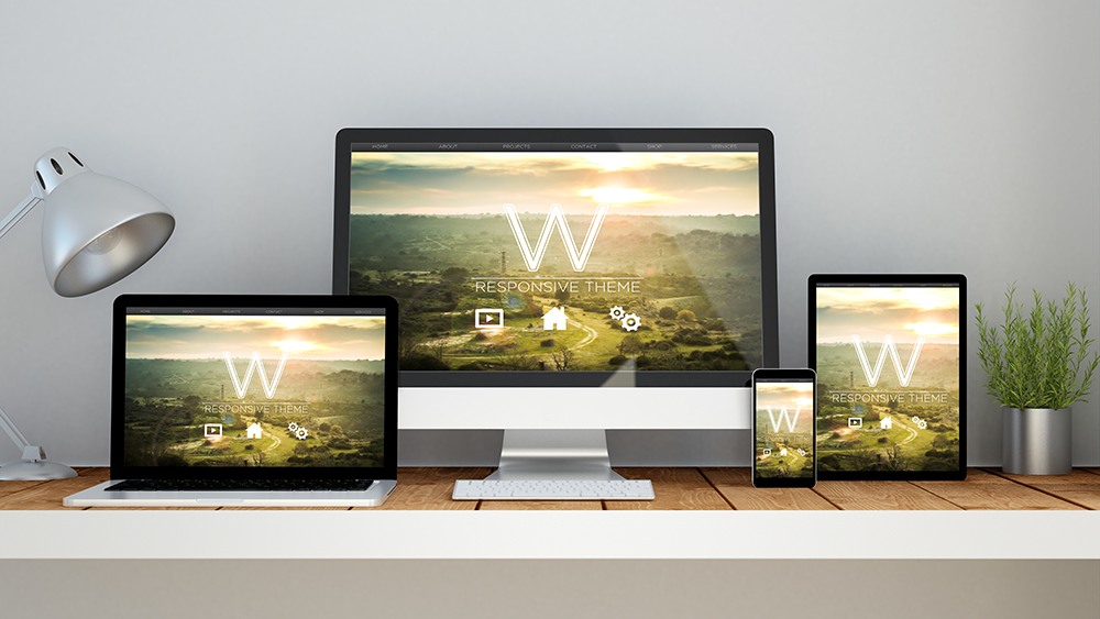
It's necessary to keep all the important information “above the fold” so that visitors can easily notice it. And as today most of the customers use their phones to surf the internet, it's more important to make your restaurant website mobile friendly. This does not mean that you have to ignore all others. So, keep desktops, laptops, and tablets in mind too.
6. Optimize for Maximum Speed
Slow loading time are big conversion killers. If your website is slow, why should visitors think your service is any better? It’s paramount that you optimize your restaurant’s website design for maximum speed. If the pages of your site load fast, your website’s visitors will be able to explore quickly; instant results will encourage them to feast with you once.
7. Hassle-Free Forms
The forms on your eatery website -- such as online contact forms, reservation forms, and feedback forms -- should be easy-to-use with minimum questions. Don't make these elements complex otherwise the customers will definitely abandon your site just before reserving a seat.
8. Update Regularly & Implement Analytics
The marketplace is dynamic where new trends keep coming over the horizon every day. In order to cope, you should look at updating your restaurant website design regularly and include new features and useful functionality. How often you update will really come down to your budget and time, but relying on an old design usually isn’t great for business.
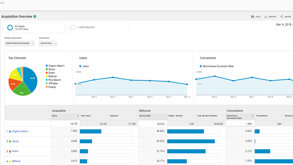
Updating your design isn't enough to maximize conversions, of course. You also have to track the status to analyze the performance of your website. Therefore, ask your design team to integrate it with platforms like Google Analytics so that you can keep a proper track of all the major aspects like page views, keywords, visitors, etc.
9. Precise Logo Placement: Cherry on Top
You should try to place the logo of your restaurant at the top left corner of your menu. The left side is where the majority of the visitors will start scanning your site, so it will be the center of attraction.
You can use these tips to build a mesmerizing web design for your restaurant which will be a magnet to potential customers for attracting them and convincing them to try dining out with you and become frequent visitors. Also, they can recommend your eatery to their peers and in this way, you can get hundreds of new customers.
About the Author
Anubhuti Shrivastava is a content crafter at Arkenea and Benchpoint. She is passionate about writing articles on topics related to design and the software development industry.


